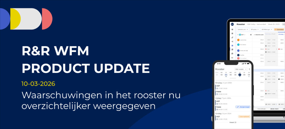
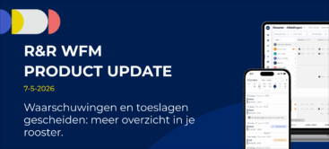
Warnings in the schedule are now displayed more clearly
In an ideal scenario, of course, you'd see as few warnings as possible. In practice, however, they're just part of the deal. Still, all these icons can clutter up the screen, making it harder to get a quick overview.
Based on feedback from our users, we have therefore adjusted how warnings are displayed in the schedule. The goal: a clearer view without you missing any important information.
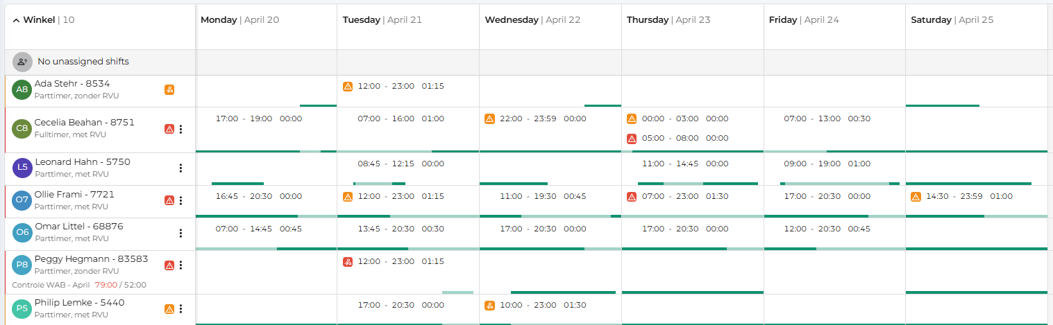
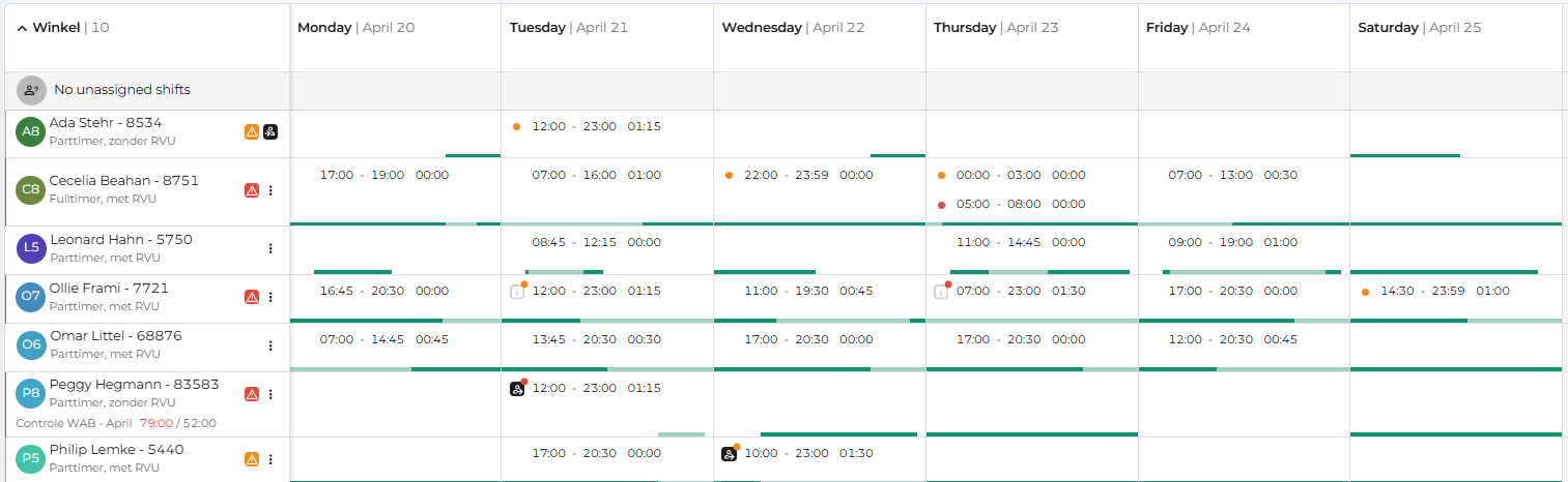
If there is a warning for a service, a small orange or red icon appears next to the service. This icon indicates that there is a warning.
Is there already an icon for the service—for example, for a temporary employee or an indirect service? If so, that icon simply remains visible and is supplemented with a dot.
You can see the type of warning in the first column next to the employee's name. There you'll find the warning icon, which indicates what type of warning it is.
With this adjustment, all relevant icons remain visible, and you can see more information at a glance. At the same time, the overall layout of the schedule looks cleaner. This helps you keep track of everything more quickly and makes it easier to manage your planning.
Previous Situation
New Situation
It's a small change, but one that makes working with the duty roster on a daily basis much more pleasant.
Do you need help or would you like to provide feedback?Our Service Desk (support@rr-wfm.com) is happy to assist you, and we'd love to hear your thoughts on this update. Together, we can make it even better.
Would you like to be the first to hear about our new products? Sign up on this page, and we'll add you to our mailing list. Would you like to read past newsletters again? You can do so at any time on our website. You can find the archive of our product updates here.